ShopDreamUp AI ArtDreamUp
Deviation Actions


Suggested Deviants


Suggested Collections


You Might Like…


Featured in Groups


Description
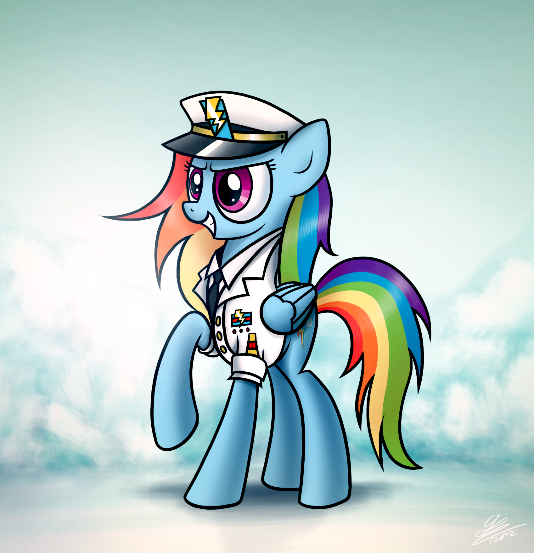
My very late Christmas present for my awesome friend 
I watched 'An Officer and a Gentleman' and got inspired to draw this. Doesn't she look amazing as a Wonderbolts officer?
For those asking; this is based of the uniform Spitfire is wearing in the episode.
I watched 'An Officer and a Gentleman' and got inspired to draw this. Doesn't she look amazing as a Wonderbolts officer?
For those asking; this is based of the uniform Spitfire is wearing in the episode.
Image size
1697x1760px 1.77 MB
Comments78
Join the community to add your comment. Already a deviant? Log In
Let's see here. Starting with the good stuff: I really like the colors, especially the cloudy backdrop; it gives a nice ambiguity between fog on the ground or the tops of clouds way in the sky. The shadows are generally all right, but lacking in a few areas that I'll get to later.
Now, critique: the shadows are all in total disagreement with each other. The head is lit from the top, the legs squarely from the left, the mane from below and the tail almost not at all. The shade from the brim of the cap and her muzzle are definitely shadows from above—and so is the shadow she casts on the ground—but her legs all have their shadows completely on the right. Figure out exactly where you want your light source to be and work from that so you can get some consistency in your shadows. The mane is brightly highlighted from the bottom left, something nothing else on the body agrees with; the tail, meanwhile, has no significant shadows at all, just getting slightly darker towards the bottom.
Speaking of the tail, yours starts out too thick at the base and looks very flat. The completely straight highlight along it—a highlight that, again, disagrees with the light source of any other shadows on the body as well as the highlights on the rest of the hair—does not give a sense of volume or roundness at all, which makes the tail look deflated and 2-D. The completely flat spikes don't help, either.
Like 10art1 said, her neck is very long, longer even than her body, something emphasized by the tilted perspective. In this case both the neck and torso should be brought to a more middling length so she doesn't feel so horizontally squashed and cramped.
Her one raised leg has a gigantic foot. It's the size of the feet on the back legs, which it should not be; this'd be a big dead weight that would make walking a chore. On front legs the feet are a little longer than the leg, but not by much; it's a little under half, most of the time. This one here is like three-quarters of its length and it looks stupendously awkward.
Her ears and eyes are exceedingly large, though that might've been intentional. I don't take too much issue with it, though I do prefer more held-back sizes. Her nearest eye needs to tilt, more, though; eyes are at slight angles, pointing towards the mouth and ear.
The ankle joint of her back leg is very, very, uncomfortably thin; I assume this leg is supposed to be straight and non-bent; in that case, the back of the leg would assume much more of an "S" shape to highlight the still slightly bent knee (ponies never really fully extend their legs, hence the constantly jutting hock). That "S" shape is also going to lead much more vertically into the hock so the leg doesn't feel quite so... snappable. Not to mention the fact that the far leg is lacking a hock joint at all, or its is just much thicker.
The huge wavy curves of her pressed-down head mane are a little out of sync with the rest of her hair, and it's much bigger than it should be; her hair coming out of her head wouldn't hang down that low.
The angle of the lapels on her shirt disagree with the amount of chest we can see on it; the shirt itself seems to be viewed completely from the side, whereas the lapel—and most of her body—imply more of a 3/4 angle. I'd go with the rest of the drawing and add more of her chest on the other side.
This is a very minor gripe, but the back collar of her shirt is disconcertingly tall.
The outline around her wing is very thick, and I'm not really sure why; it draws undue attention to a detail element when the thicker outlines should be around the outsides of the major shapes.
Her furrowed brow looks very flat, though I can't exactly pin down why; I think it's mostly to do with the one above the far eye.
Don't worry about the length of this critique, by the way; I've written much longer than this many times over. This is actually a pretty short comment for me.